Bastien and Scapin’s criteria
J. M. Christian Bastien and Dominique Scapin are 2 researchers in ergonomic psychology and cognitive ergonomics who have conducted work on user interfaces. In 1993, they published their heuristic, also called “Bastien and Scapin criteria” allows to measure the usability of a website, software or application through criteria.
These criteria allow to measure the quality of the interaction between the user and the interface through 17 criteria divided into 8 categories that we will present to you here.
This article is quite long, but allows to list all the categories and criteria. We will see in a second time to make a summary sheet! 😁
1. Guidance
Guidance is the first of the 8 categories of criteria. It helps the user to interact with the interface.
It includes 4 criteria:
Incentive
First of the criteria, incentive, as its name suggests, encourages the user to perform specific actions and presents the different alternatives.
We can list:
- the indication of the appropriate format to enter in a text field (e.g.: dd/mm/yyyy)
- the addition of a label for the fields to be filled in
- the announcement of the expected length in a field
Grouping and distinction between items
This is simply the visual organization of interface elements.
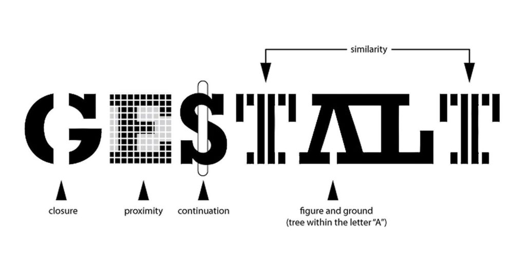
Reusing among other things the Gestalt principles (form in German), this criterion allows to differentiate and/or bring together several elements visually:
- by location: close, they seem connected, separate, they do not concern each other
- by format: with the same size, the same color… the elements come together
A good organization of the elements on an interface offers a more pleasant experience for the user, allowing them to find their way around and memorize the elements.
Immediate feedback
This is one of the most important criteria: showing that an action is performed as quickly as possible:
- showing the real-time entry of fields allows you to indicate to the user where they are
- indicating a bug, a delay allows you to inform the user of the processing of their request
Readability
This criterion is closely related to accessibility. Offering the user a thoughtful interface, not only to be pretty, but also and above all to be readable, is one of the best ways to avoid frustrating them and to make their reading easier.
Readability includes all the lexical characteristics:
- length of lines of text
- case of titles and text
- alignment and justification of text
- avoidance of hyphenation
- …
Reading on a screen is less easy than reading on paper: the typographies are different, the distance changes… Making it easier for a user to read by respecting defined criteria thus makes it possible to bring together the best conditions.
2. Workload
Second category of Bastien and Scapin’s criteria! The greater the workload, the more errors will be present.
By reducing the load that a user perceives, by reducing the actions and their duration, we also reduce the risk of abandonment.
We distinguish 2 criteria in this category:
Brevity
The faster the activity, the fewer errors will be present.
Indeed, by being concise and reducing the actions, the user sees his experience improved, because his reading and typing work is reduced.
Information density
Information density refers to the perception that a user has of a set of elements.
When too many elements are perceived or when he is asked to remember previous actions or data, users perceive it negatively. It requires too much attention and effort from them when the action could be avoided or appear differently.
3. Explicit control
This is simply the user’s control over the interface. The system must react correctly to their actions. This category includes 2 key criteria:
Explicit actions
When a user acts on an interface, their action must be executed at the time they request it and without a hitch.
User control
The user must be able to control their actions.
They must therefore be given the possibility:
- to interrupt a procedure in progress
- to cancel an action or allow them to resume a previously canceled action
- to allow them to easily go back
- to allow them to control their typing pace rather than depending on the pace of the system
4. Adaptability
Adaptability concerns the system’s ability to react to the user’s actions and preferences. A task can indeed be performed differently depending on the user’s profile and situation.
2 criteria refer to it:
Flexibility
Flexibility can be translated (with tweezers) by accessibility: the system can offer options for customizing the interface and accessibility to users.
Taking into account the user experience
The interface must adapt to the user’s level and not exclude certain types:
- Experienced users can skip certain steps, in particular by using keyboard shortcuts.
- Novice users require more support and must not be slowed down by a lack of understanding.
5. Error management
How to get around errors? This is the question answered by this category through 3 criteria.
Protection against errors
The interface must prevent and detect errors. By implementing an analysis during entry rather than during validation, users are therefore informed at the right time.
We can thus:
- indicate to users when the session ends and offer them to continue their session.
- include the mentions “mandatory” or an asterisk * in the labels to indicate when a field is necessary
- …
Quality of error messages
Error messages are very important. In addition to the traditional 404 error indicating that a page was not found, few people know the meaning of error codes. This is why messages must be short, in the right place, precise and easily understandable.
Error correction
The system must allow users of the interface to correct their errors, during and after entry:
- Indicating the progress live in a maximum number of characters allows the user to see where they are
- Showing the expected data format allows (see Guidance > Encouragement) to correctly fill in the data
6. Homogeneity and coherence
Bastien and Scapin’s basic criterion, it is a question here of respecting the same style, the same codes and the same locations on the entire interface to preserve homogeneity and coherence.
Today we also speak of a design system allowing the establishment of the components to be used throughout the screens of an interface (colors, typography, buttons, text fields, etc.).
7. Meaning of codes and names
Every action has a code. Copy-paste is done with a Ctrl-C/Ctrl-V. If this shortcut were to change, many users would be very helpless.
On an interface, it is the same thing:
- the icons have a code that a majority knows:
- the gears or tools for settings
- a stylized character for the customer area
- an arrow coming out of a rectangle to disconnect
- the colors have a code:
- red for an error
- green for information, a correct entry
8. Compatibility
The last of Bastien and Scapin’s criteria, it refers to the relationship that several elements can have between them:
- the characteristics of the user (age, perception, expectations, skills, etc.), their constraints (situation, disabilities, etc.) and the tasks performed.
- the compatibility between the user’s actions and the system’s results.
- the coherence between the different stages of a process.
In summary
The Bastien and Scapin heuristics or Bastien and Scapin criteria have become references in ergonomics, because they allow to evaluate an interface without necessarily using user tests. From an initial analysis, they allow to highlight usability problems in order to correct them as quickly as possible, from the design stage, to create pleasant, interesting and easily usable interfaces.